RoMapp
Move around Rome without stress


Case study
PROJECT INFO
Description
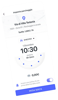
RoMapp is a project commissioned by a big technology and smart mobility company meant to be used by Romans and tourists, helping them in different daily tasks. It allows you to find the best route to take from one place to another, it allows you to buy tickets for all the different means of transport, to pay for your parking spot and it gives you updates on the traffic and transport-related problems.
My role
Research, Personas, User flow, Information Architecture, Wireframing, UI, Prototyping
Tools
Figma, FlowMapp, Sketch, Invision
Duration
4 weeks
RESEARCH
Introduction
Different apps all over the world with the same objective already exist, this type of app is familiar to the majority of people who have to go working by public transport, that’s why my team and I didn't find many obstacles in this phase of the design and it was relatively easy to conduct. My team and I evaluated 14 different apps with Jakob Nielsen’s usability heuristics and with a cognitive walkthrough examination. Moreover, thanks to the vast amount of reviews on online stores, we could understand where the already existing similar apps were lacking. We found different pain points and problems in each app that helped us develop our main goals for this design.
Problems
The main problems we identified are that interfaces are not always intuitive, it is difficult to fill out forms for buying tickets, there are often few choices of payment methods, it is not easy to navigate throughout the apps and the majority of the apps don't have news on traffic.


Goals
-
Make RoMapp easy and fast to use for everyone
-
Make users more engaged
-
Create an app that gathers all the essential features a user would want to use to move around the city.
DEFINE
Personas
Based on statistics and demographic data, we defined two personas.


Information architecture
Subsequently, we had a brainstorming session where we drew high-level wireframes/sitemaps on a whiteboard, listing all the needs that we could extract from users' interviews and the desk research we previously completed.
After having our ideas cleared we designed a sitemap that could help us truly visualize the app’s flow, we mapped out the information architecture that gave us a better idea of how to organize the content in each section of the app and how many screens a task would take to be completed.


Wireframes
At this point, we had gathered enough information to start creating the wireframes. The wireframes we designed have been user tested and modified accordingly to the results.
DESIGN GUIDELINES
Color palette
Typography

VISUALS
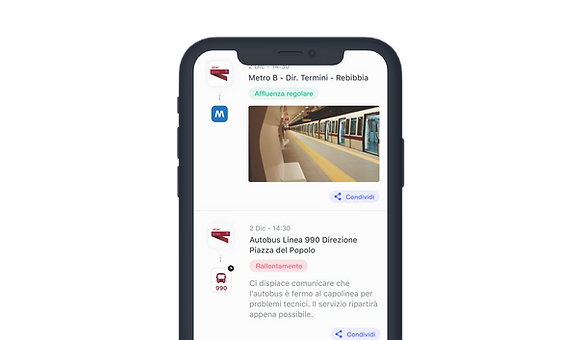
The app is grey-scale with purple as the main colour to give life to the design. The first screens the user encounters are the onboarding ones. These were a necessity to explain to the user how the app works and ask for technical permissions. The homepage presents a map with different POIs, that can be filtered. Here users can plan their routes, start the flow to buy tickets, or pay for parking spots. Tickets will be stored in the section "My wallet". A news section, which from the user research resulted essential, has been created. Here users can read all the daily occurrences and problems related to the city's public transport.


PROTOTYPE

CONCLUSIONS
Designing this app from scratch within a time frame of two weeks was a big challenge, indeed. I would have conducted more user testing between the wireframes and the high-fidelity prototype if I had the possibility. While working on the project I understood the importance of good UX research and the importance of creating a solid architecture so that the design won’t be altered too many times due to a misconducted previous phase.
The app is under NDA and still hasn’t been published in the online stores. It would be amazing to continue to test it and improve the design thanks to the reviews of a variegated number and types of users. I'm looking forward to it 🔥💪🏻 .